The Christie
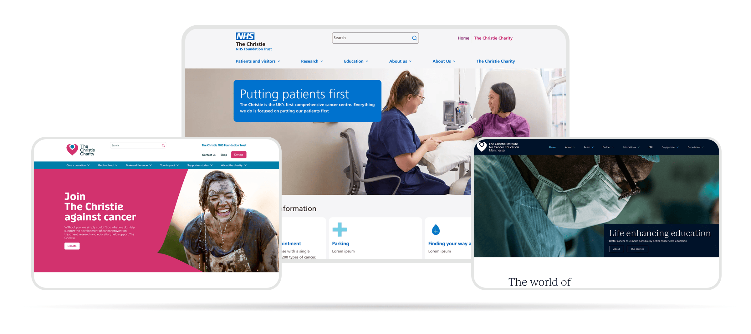
NHS, Charity & Education – Three Digital Properties
UX and UI design across three interconnected digital properties for one of Europe's largest cancer centres: the NHS Trust website, the newly independent Christie Charity site, and the Christie Institute for Cancer Education.
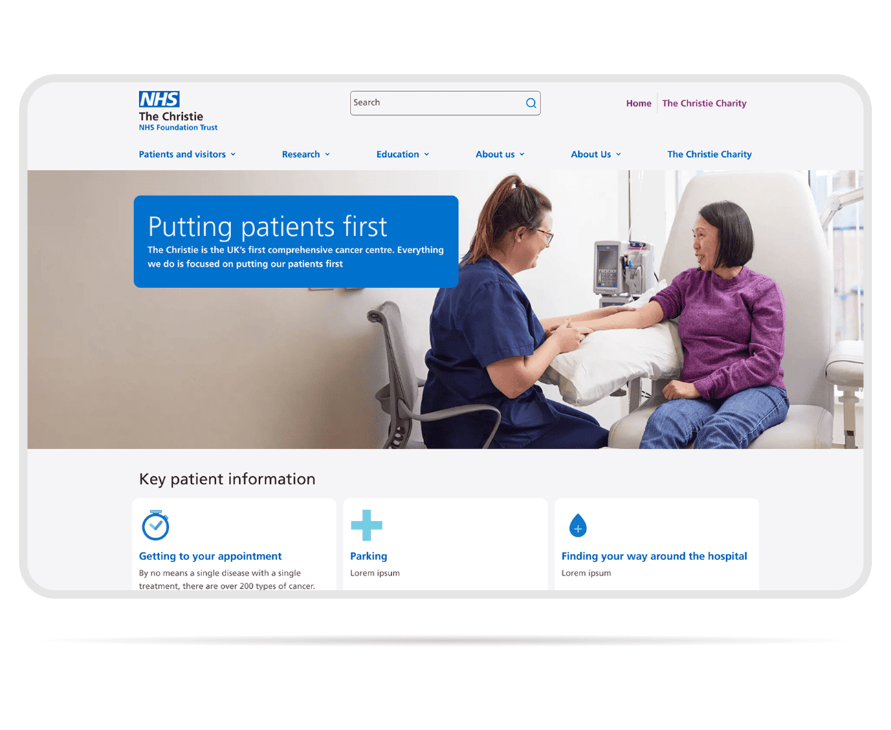
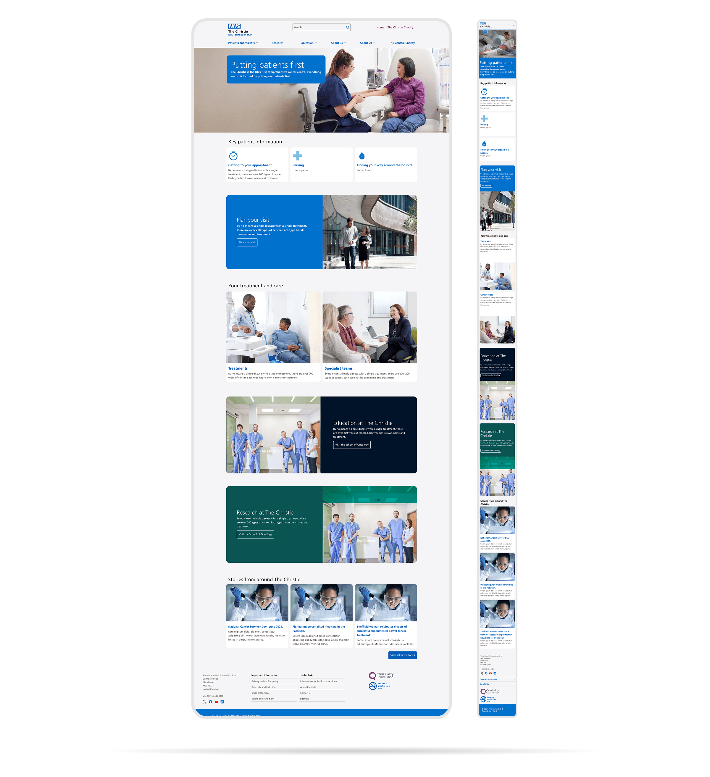
The Christie NHS
The primary public-facing website for one of Europe's largest cancer treatment centres, serving patients, families and clinical staff with clear, accessible information across a complex content estate.
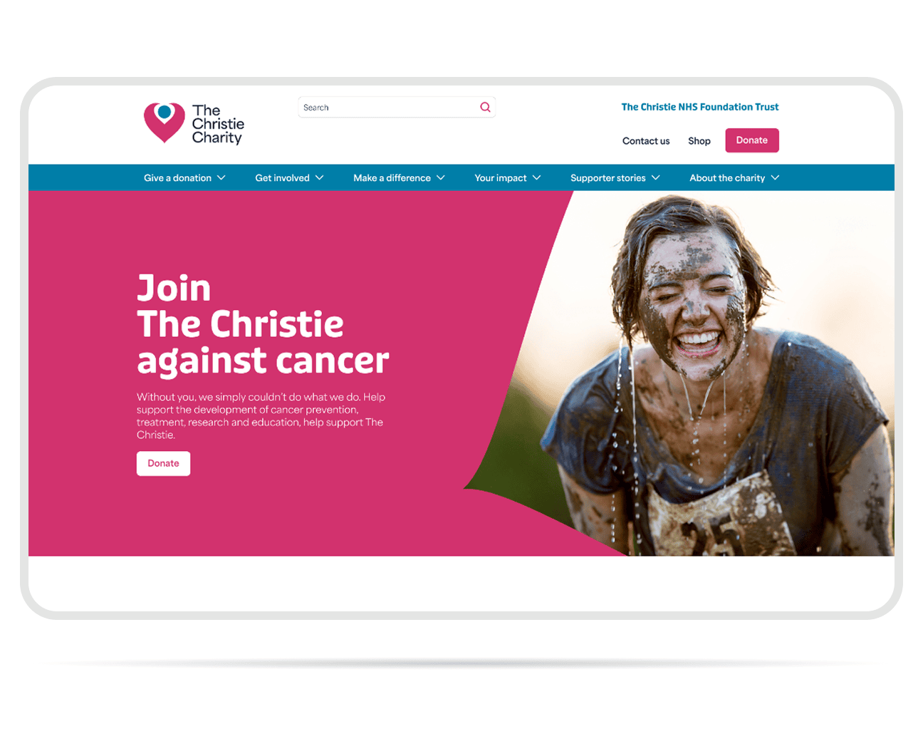
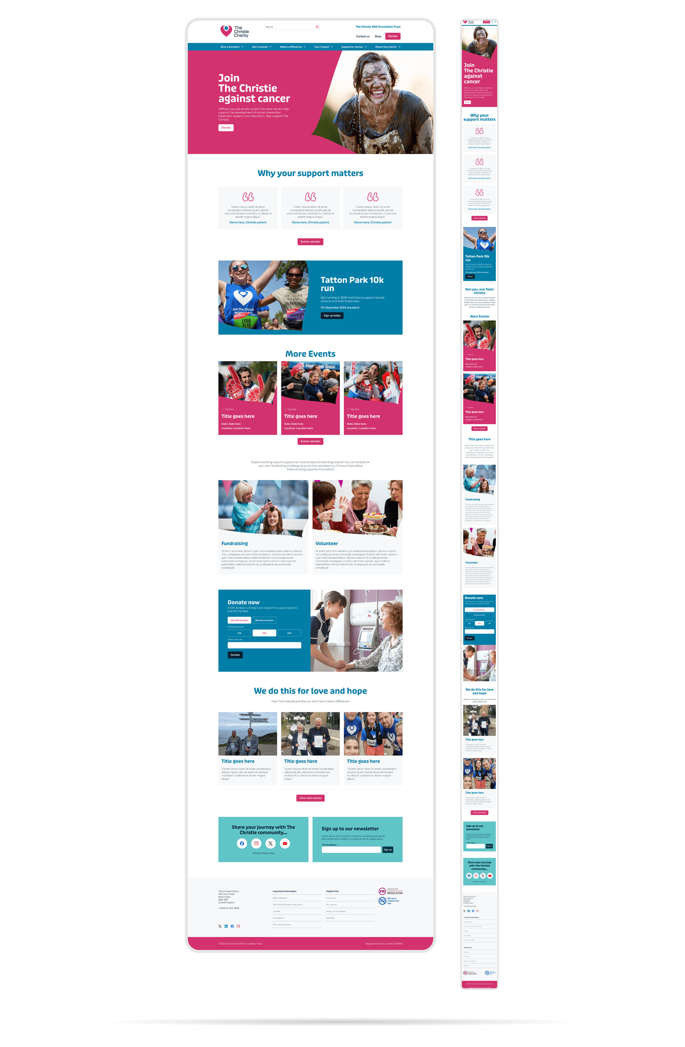
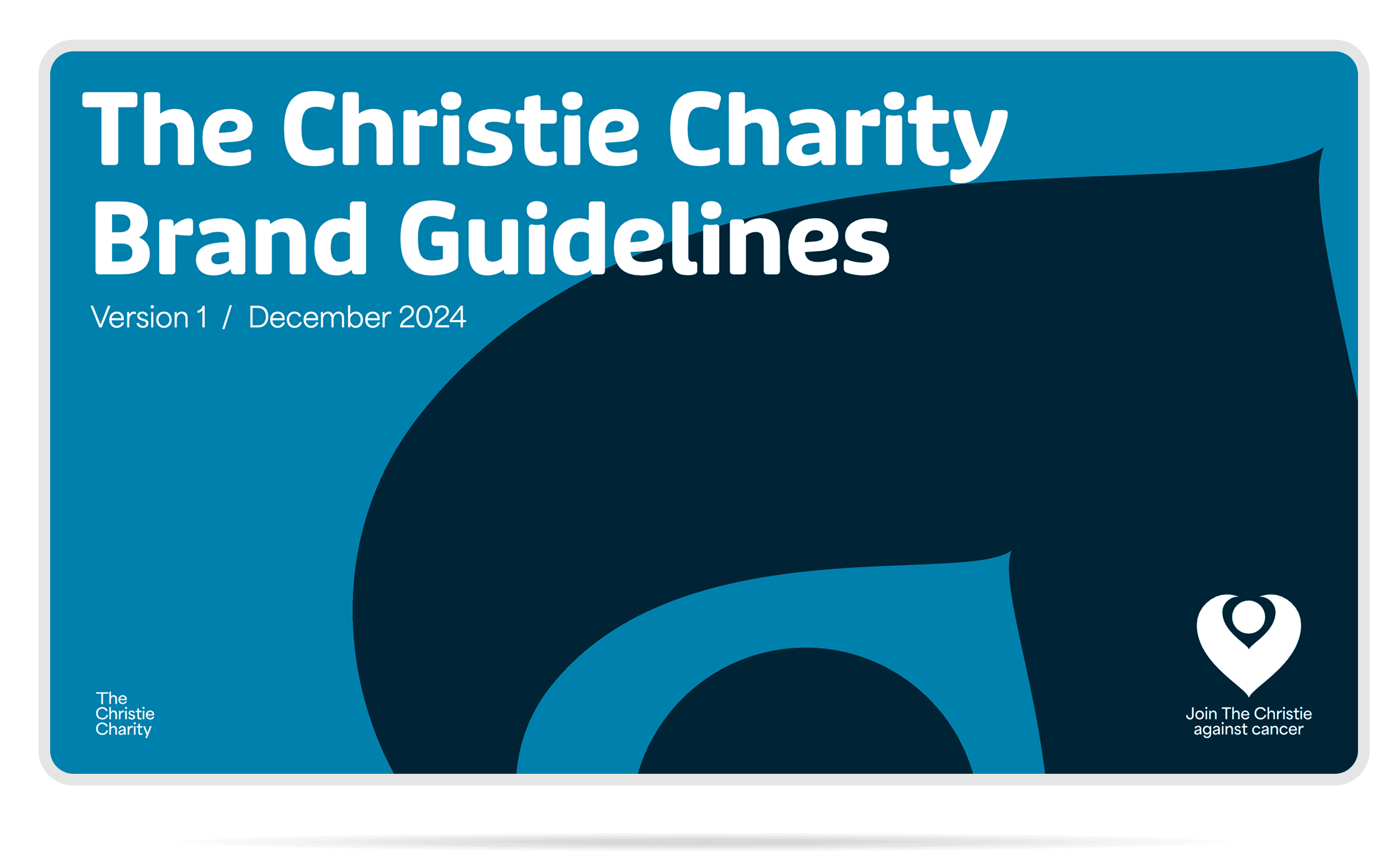
The Christie Charity
Following the Charity's separation from the NHS Trust, a new brand identity was introduced. The digital experience was designed to reflect that independence while retaining the recognition and emotional connection built over decades.
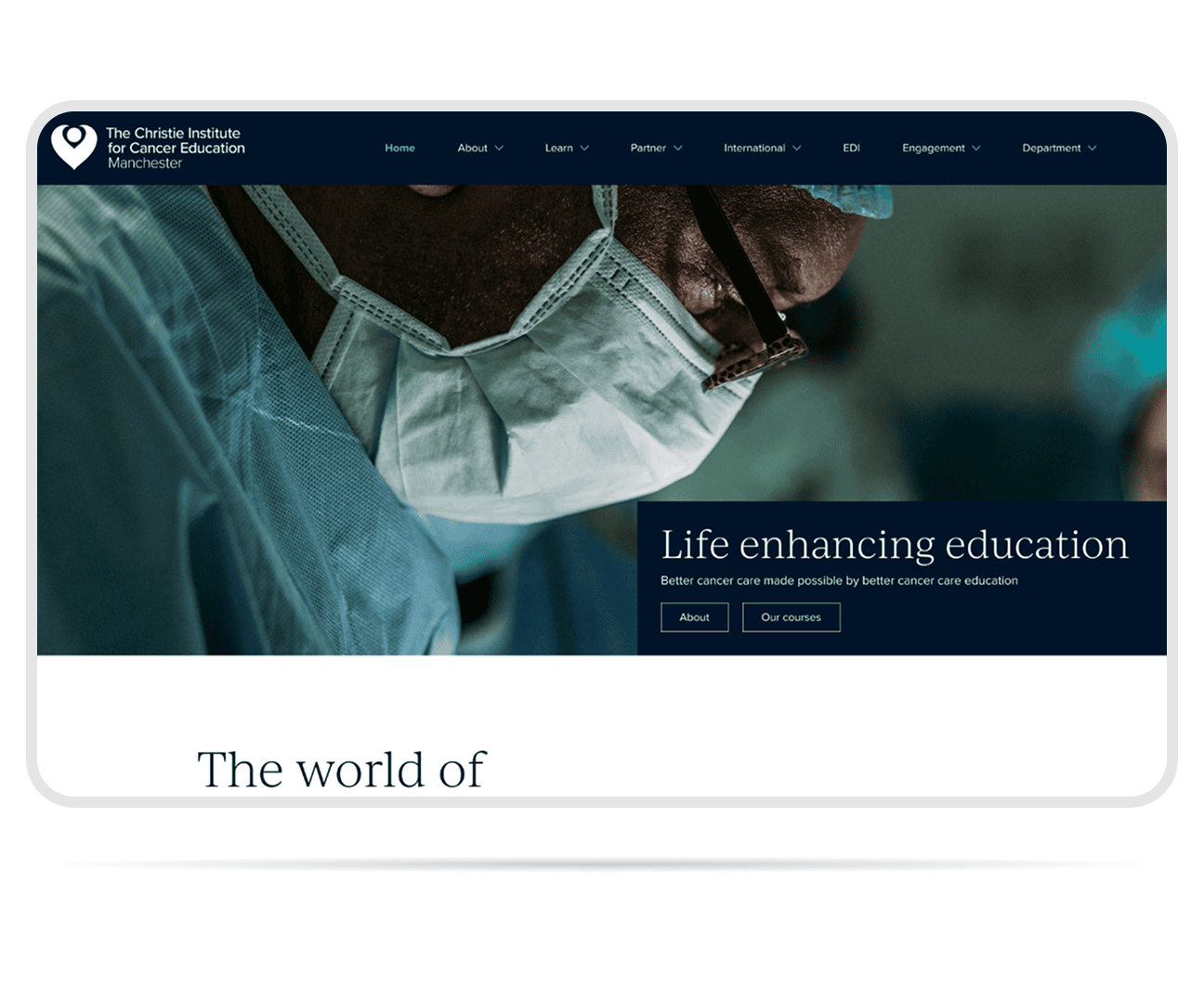
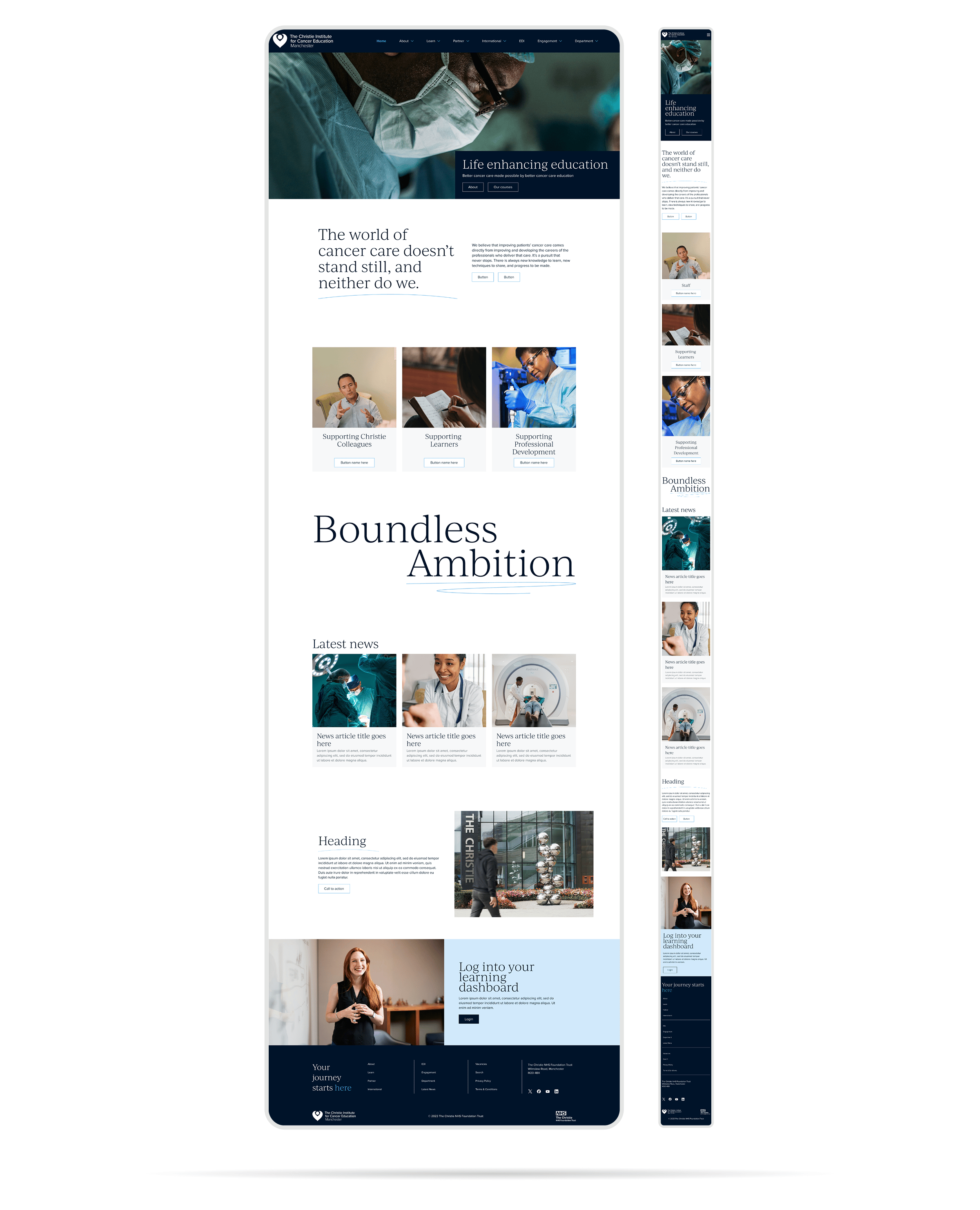
Christie Institute for Cancer Education
A dedicated digital platform for the education arm of the organisation, supporting clinical training, research resources and professional development for healthcare teams across the UK and internationally.
Brand Refresh
The Charity's new visual identity centres on The Embrace, a heart and location pin symbol with significant legacy, reinterpreted with a refreshed colour palette, new typefaces and a flexible layout system spanning print and digital.
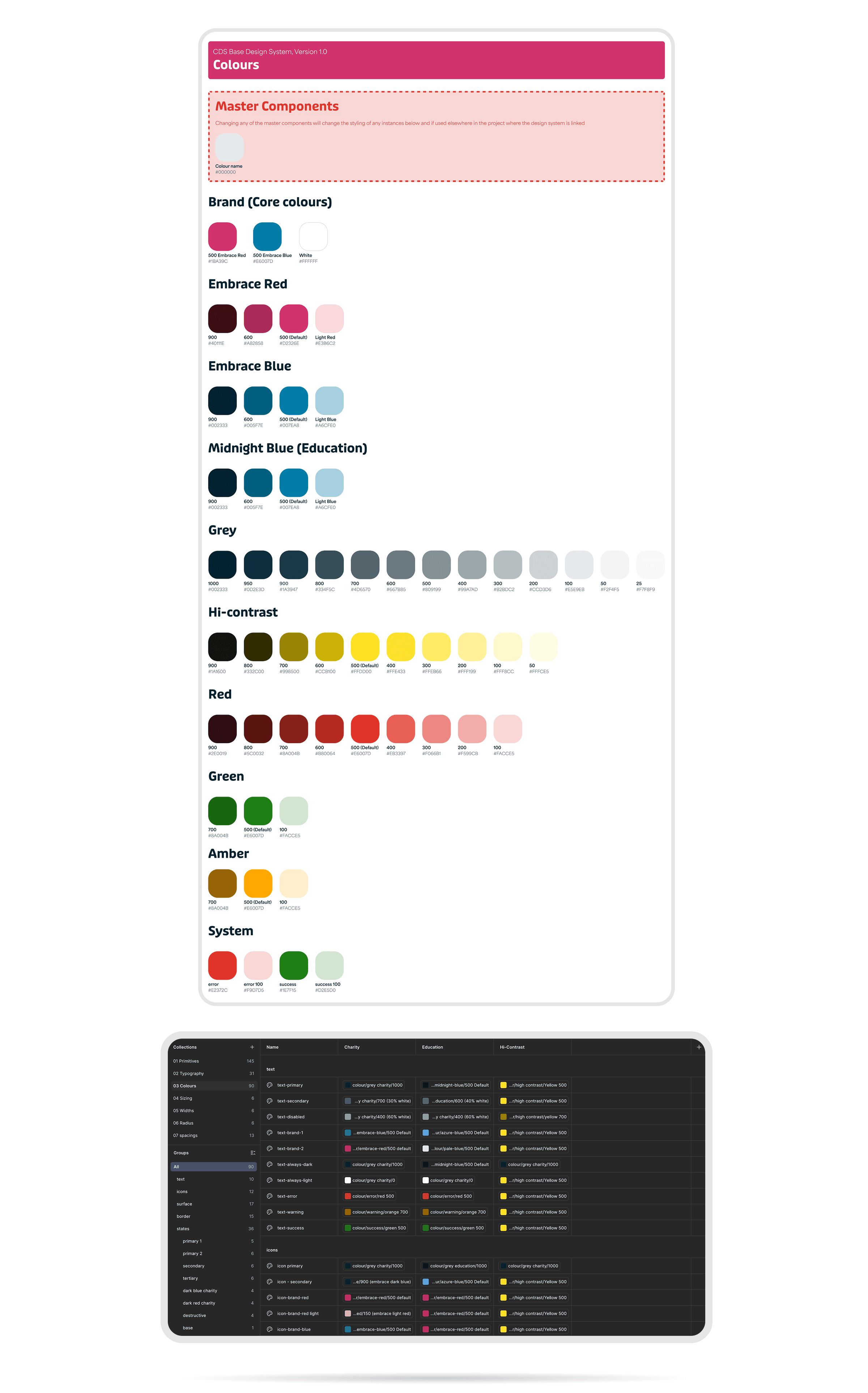
Design System
A shared component library and token system underpinning all three properties, ensuring visual consistency across a complex multi-site estate whilst allowing each surface to serve its distinct audience and purpose.