Rebrand and Website
HMA is a specialist communications agency working with some of the world's leading technology brands. I led a full rebrand and website redesign, developing a new visual identity, design system, and digital presence that better reflected their expertise and positioned them for growth.
A refined mark that retains brand equity while projecting a more confident, contemporary identity.
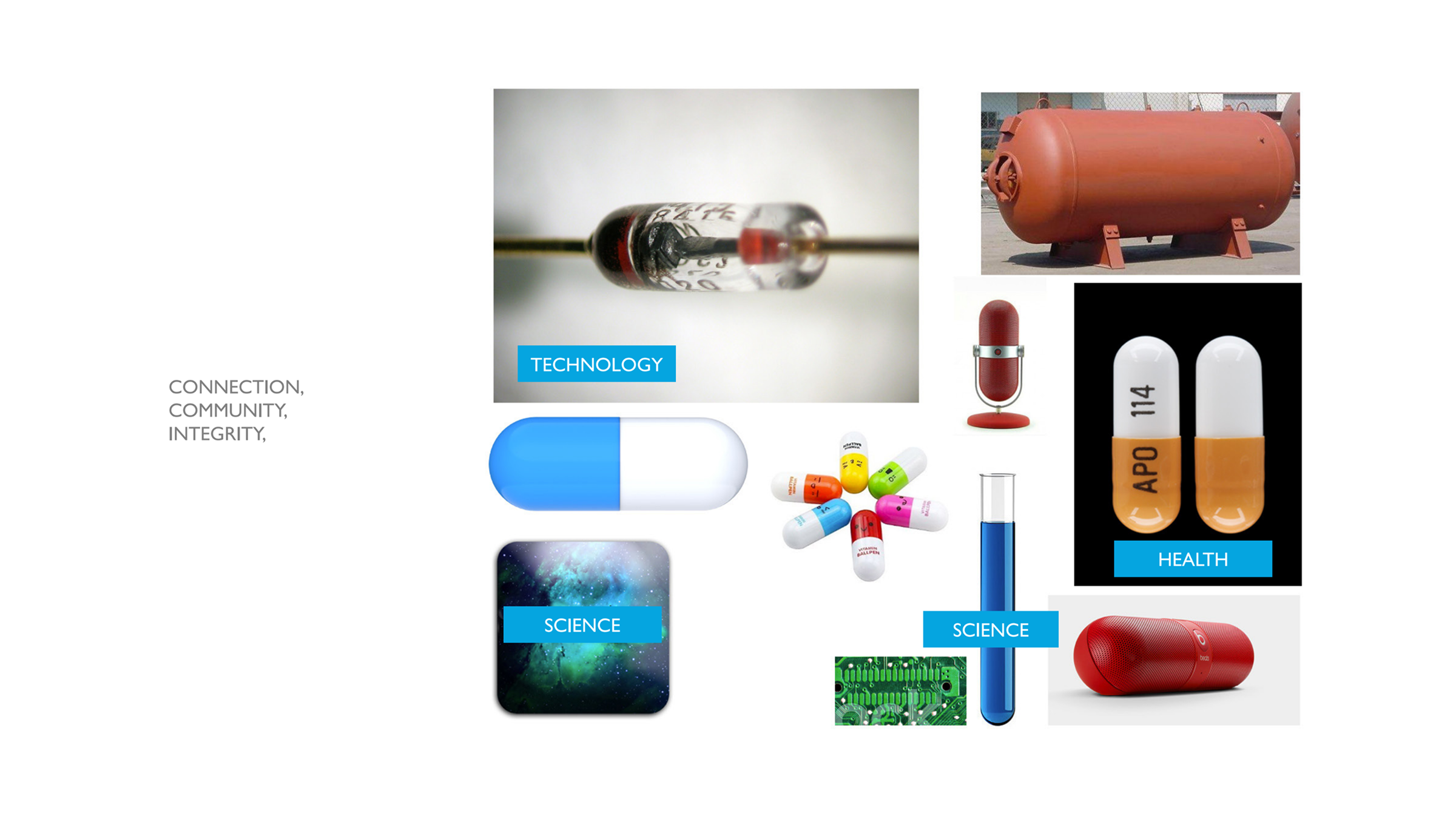
Brand discovery sessions uncovering HMA's heritage, values, and the story the new identity needed to tell.
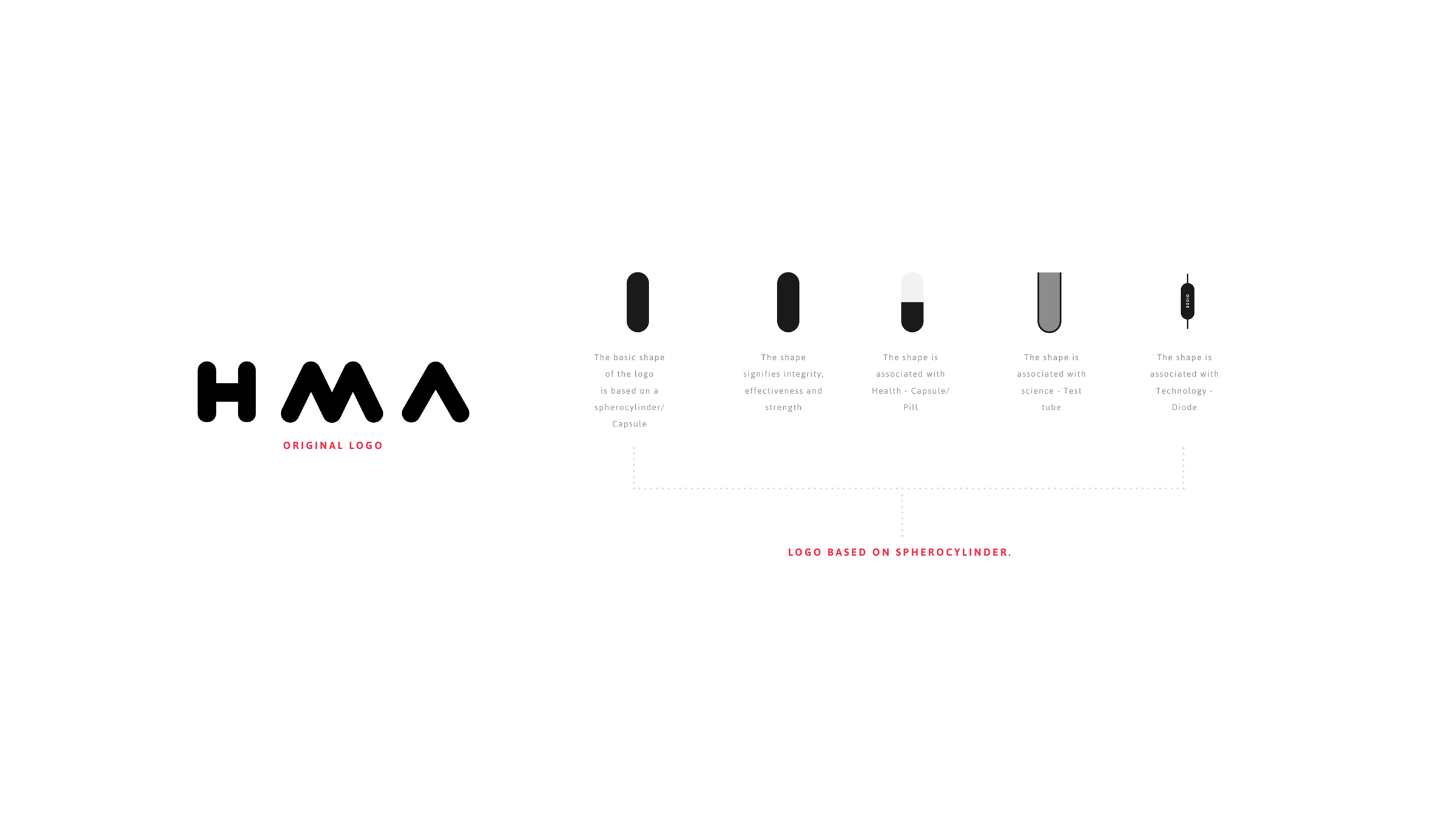
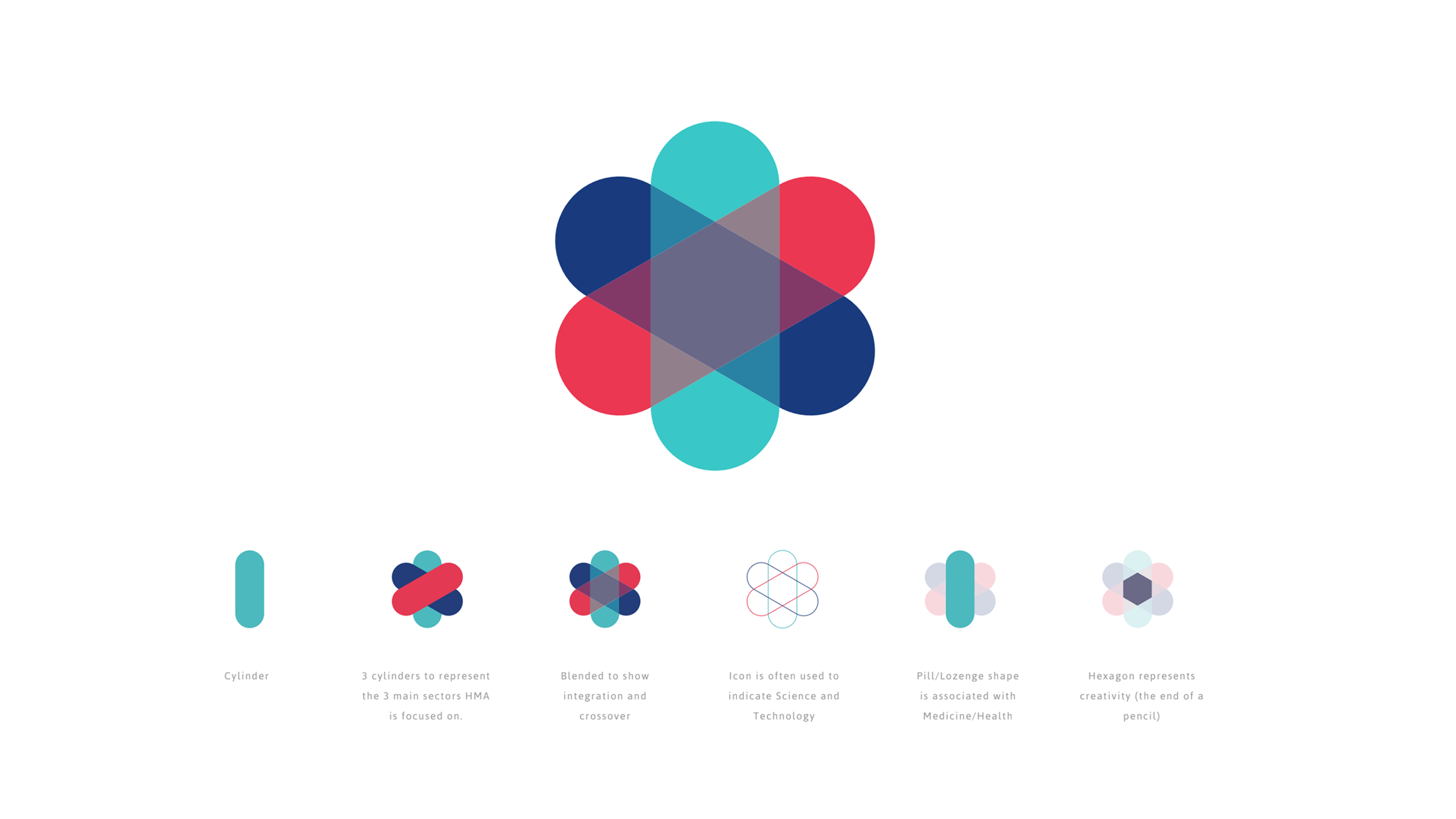
The thinking behind every design decision, from form and colour to tone and application.
A versatile graphic device that extends the brand across print, digital, and environmental touchpoints.
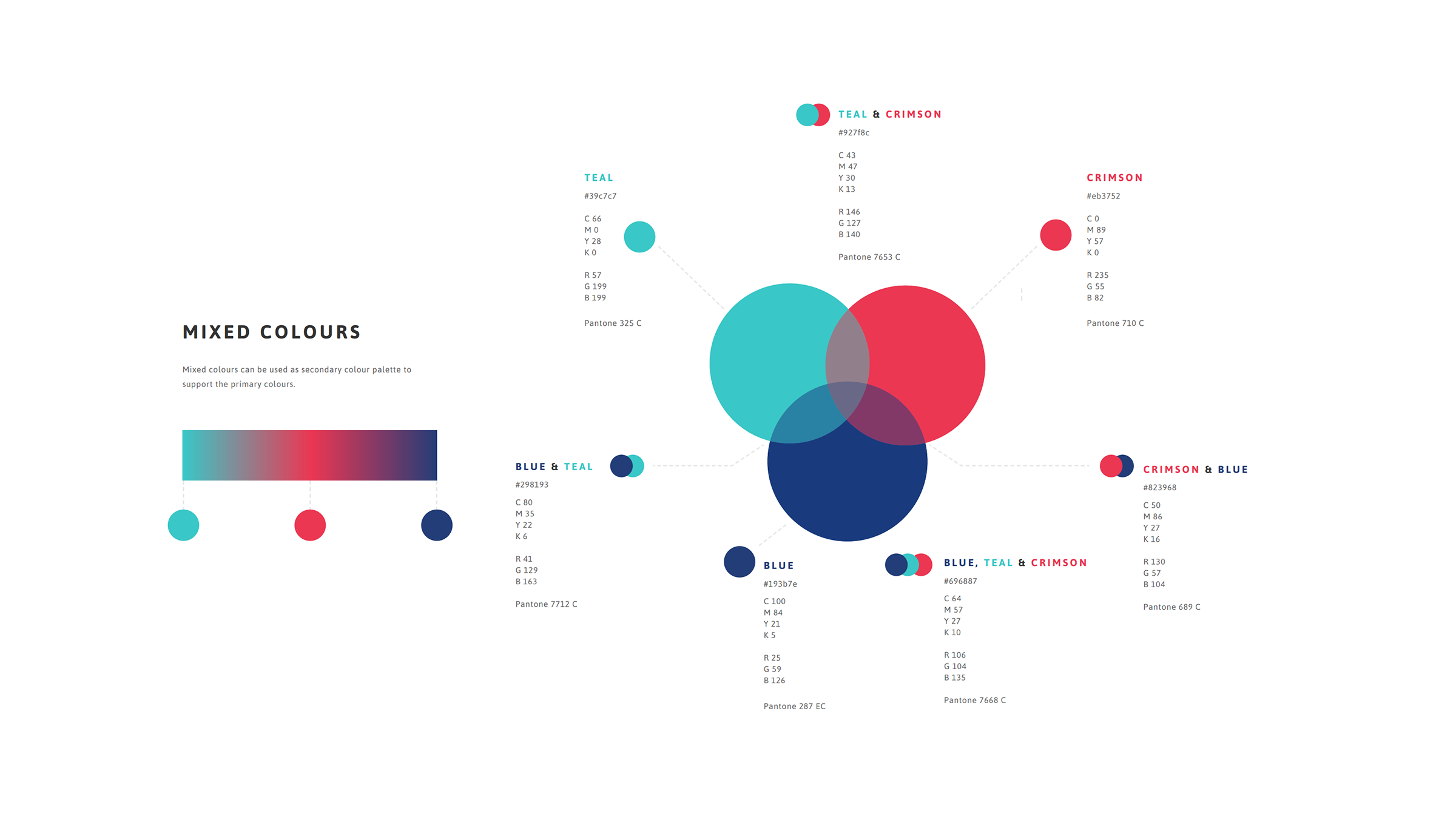
A considered palette balancing authority and approachability, tested across all primary use cases.
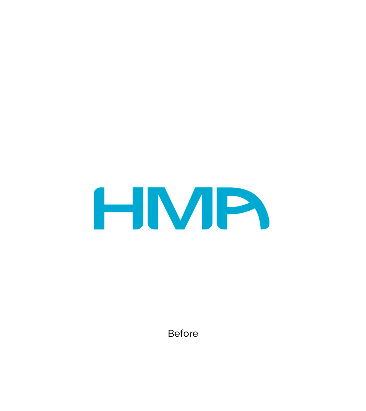
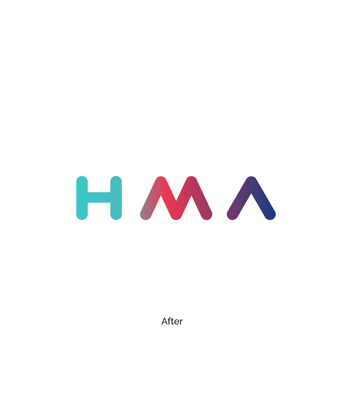
A direct comparison showing how the rebrand elevated the brand without losing recognition.
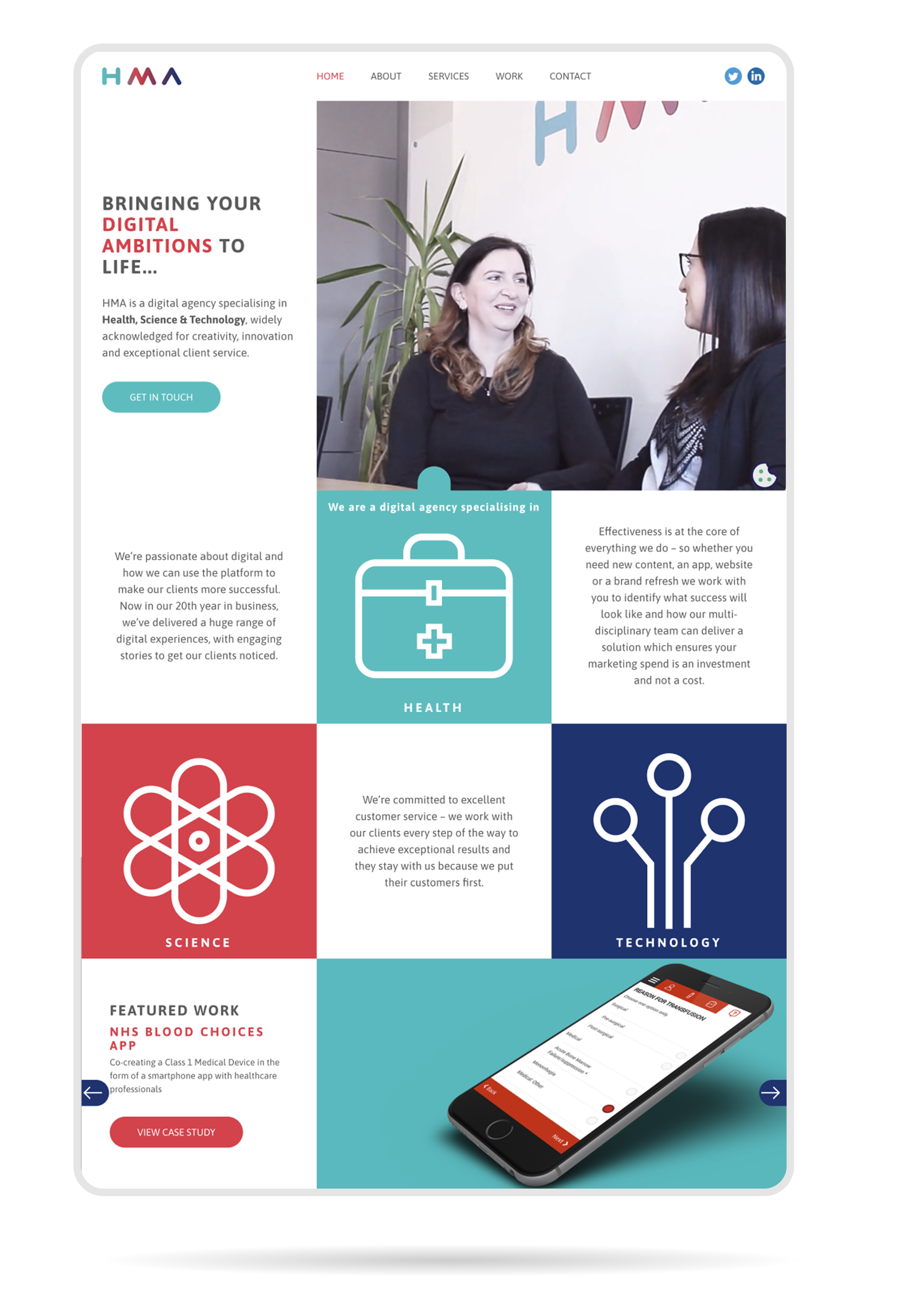
A clean, content-led site designed to reflect the refreshed brand and improve lead generation.
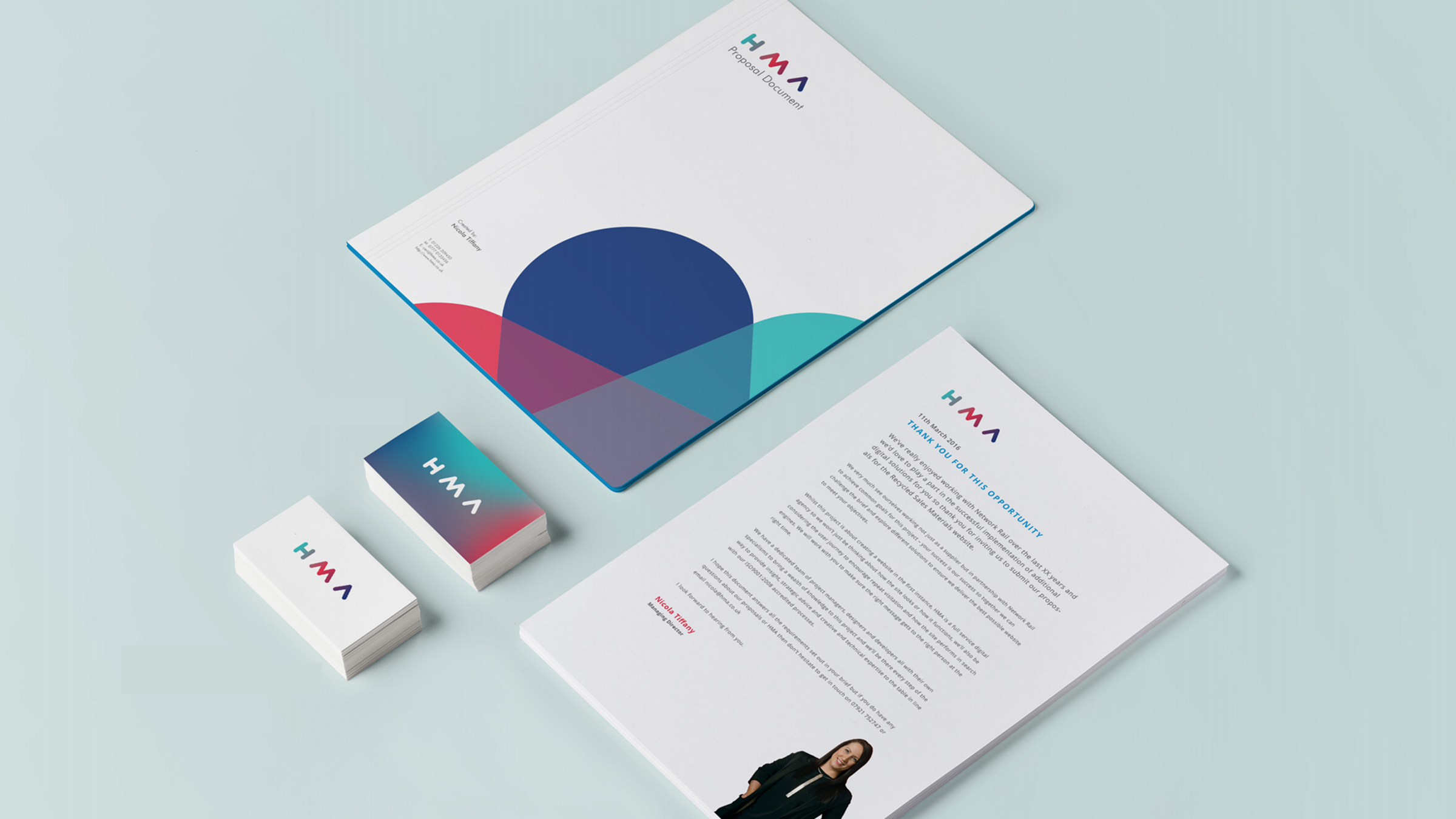
The new identity applied across key collateral, showing how the brand performs in the real world.
HMA (Health Management Agency) is a leading UK healthcare communications and medical affairs agency working with global pharmaceutical and life sciences clients. The project involved a full brand refresh and the redesign of their corporate website – repositioning HMA as a strategic partner for pharmaceutical companies navigating complex regulatory and market access environments, while projecting the credibility and expertise expected by a highly specialised audience.
The brief required balancing two competing needs: presenting a highly specialist, science-led agency with clarity and authority, while simultaneously making the brand feel modern, accessible and commercially ambitious. The previous brand lacked differentiation in a crowded sector and the website did little to communicate HMA's genuine depth of expertise.
The new visual identity drew on the language of precision and structure – clean geometry, a restrained colour palette, and considered typographic hierarchy – to convey expertise without being impenetrable. The website architecture was rebuilt around the audiences HMA actually serves: pharmaceutical clients, regulatory specialists, and prospective talent.
Discovery began with stakeholder interviews across HMA's senior leadership and client-facing teams to understand how the agency perceived itself versus how clients experienced it. Competitor analysis mapped the visual and messaging landscape of the wider healthcare communications sector, identifying clear white space for differentiation.
Brand territories were developed and tested internally before a final direction was selected. The website was then designed with a content-first approach – working closely with HMA's editorial team to develop a tone of voice and information architecture that served both lead generation and talent acquisition goals.
The rebrand was well received across HMA's client base and has been cited internally as a key factor in new business pitches. The updated digital presence significantly improved the agency's visibility in search and strengthened its positioning within the competitive healthcare communications market.